
Warner Robins unveils new logo reflecting the city’s heritage, future
The City of Warner Robins recently debuted a new look on their social media platforms showing off their new logo.

WARNER ROBINS – The City of Warner Robins recently debuted a new look on their social media platforms showing off their new logo.
The logo features a plane taking flight, which has been the city’s motto this year. Mayor LaRhonda Patrick said the city needed refreshing. Previously, the city only had their seal, which she along with the City Council learned has a purpose.
Most cities have their seal, but they also have a logo. The city started a process to also have a city logo, which was created by destination branding specialist, Chandlerthinks, a company based in Franklin, Tennessee.
Patrick believes the logo symbolizes innovative momentum, growth and limitless potential. The logo also strives to capture aviation, which is what the city is known for.
“We’re the home of Robins Air Force Base so you see the airplane in our logo, an F-15, and that is for the purpose of connecting us to aviation, innovation, electric warfare, the great things Robins Air Force Base is known for,” she said.
Patrick said when people see the image, they can easily tell its the city’s logo and message: “Where they take flight.”
Patrick describes logo-making as a long process. She learned that a lot of pieces go into creating a meaningful brand.
It was also a very “hands-on” process. Chandlerthinks visited Warner Robins to do a tour of the city. There were also interest group meetings with members in the community at different locations in town. They heard feedback from residents asking them what they think the city means to them.
Patrick said the company took this project as a serious opportunity. She shared they wanted to make sure the logo was genuine and authentic.
“They really cared about connecting to what the individuals who call our place home think about our city. It was really eye opening and an intriguing process to me because I thought it was just ‘let’s put some stuff together and see what it looks like’, but there’s a science to it,” she said.

Patrick also shared that companies who do branding for a living really “hit the mark.” She is thrilled, thankful and impressed by the finished product. She said it took time to get there because there are a lot of pieces that go into building a true brand other than just doing an artistic creation.
“We wanted something that kind of defined where we are right now. Of course we are a city ascending, as we say. We are growing really fast [and] we have a lot of innovative things happening in our city. Right now, we’re planning for the future with the downtown [and] some live, work [and] play communities spread throughout Warner Robins [by] trying to bring in a new workforce to make Warner Robins their home,” she said “It’s a perfect time to show that we’re turning anew [and] looking forward to the future with having a new logo.”
Before you go...
Thanks for reading The Houston Home Journal — we hope this article added to your day.
For over 150 years, Houston Home Journal has been the newspaper of record for Perry, Warner Robins and Centerville. We're excited to expand our online news coverage, while maintaining our twice-weekly print newspaper.
If you like what you see, please consider becoming a member of The Houston Home Journal. We're all in this together, working for a better Warner Robins, Perry and Centerville, and we appreciate and need your support.
Please join the readers like you who help make community journalism possible by joining The Houston Home Journal. Thank you.
- Brieanna Smith, Houston Home Journal managing editor
Paid Posts
Author

Related Articles
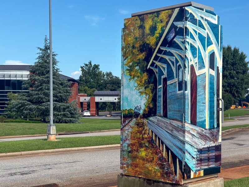
Warner Robins Adopt-a-Box program expands: When a traffic control box becomes art
The newest utility box features a piece of Warner Robins history.

Byron woman sentenced to prison, banishment after shoplifting and identity theft
The Houston County District Attorney’s Office said she had seven prior convictions.
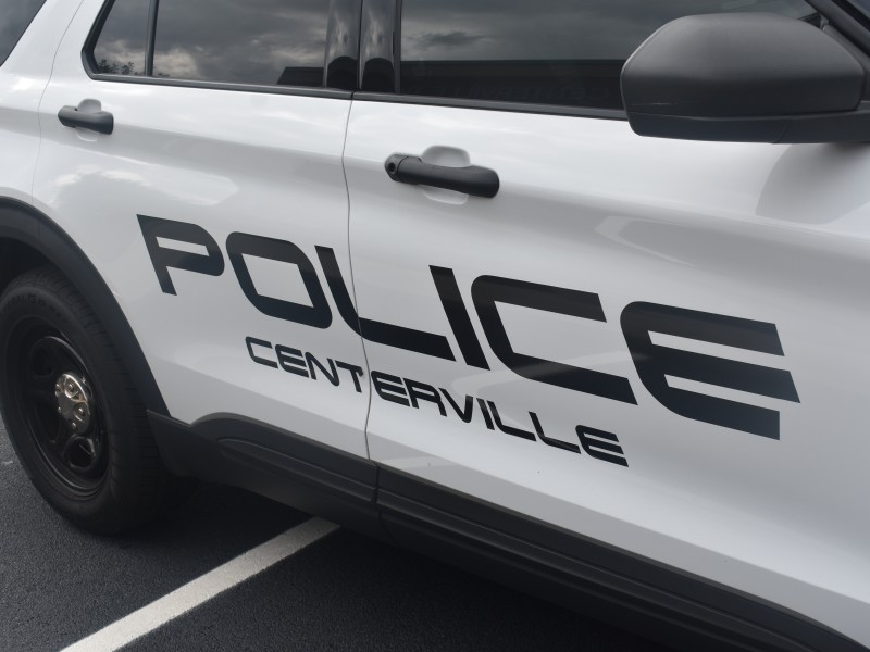
Centerville stabbing leaves one dead over the weekend, police investigating
A man is dead after a stabbing at a home in Centerville, Houston County Coroner James Williams and the Centerville Police Department confirmed.